✚ Range of Possible Answers, Maybe

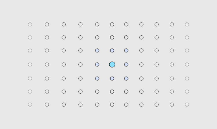
Welcome to The Process, where we look closer at how the charts get made. This is issue #250. I’m Nathan Yau. The allure of data is that it offers an exactness to the big picture. But in Statistics, analysis is more often about finding a range of possible answers than it is about finding a precise one.

Become a member for access to this — plus tutorials, courses, and guides.

✚ More Noise, Better Signal

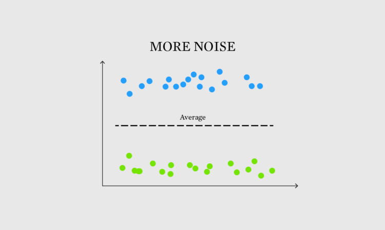
This is issue #222 of The Process, and this week I’m wondering about the times when noise, something we often try to minimize in data, makes for a better signal.

Become a member for access to this — plus tutorials, courses, and guides.

Building a happy life, interpreted through data

How to Build a Happy Life from The Atlantic is a podcast on finding happiness:

In our pursuit of a happy life, we build, we structure, and we plan. Often, we follow conventional wisdom and strategize. But what happens when our plans fall through and expectations don’t meet reality—when the things that should make us happy don’t?

In season 3 of our How To series, Atlantic happiness correspondent Arthur Brooks and producer Rebecca Rashid seek to navigate the unexpected curves on the path to personal happiness—with data-driven insights and a healthy dose of introspection.

I’m late to this, but I had some downtime during the Thanksgiving break and liked the data- and research-centric episodes. As you might expect, there’s a lot of fuzziness in the numbers and there’s more than one way to find happiness.

Tags: , , ,

Difficulties reading the cone of uncertainty

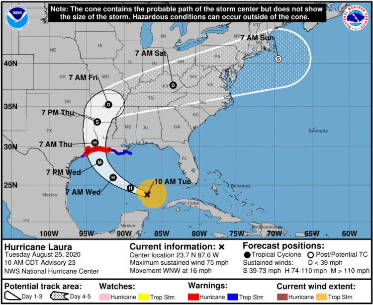
It seems that there is always surprise when a hurricane makes landfall in some areas, which some attribute to poor forecast communication with the cone on a map that shows possible paths. Scott Dance and Amudalat Ajasa for The Washington Post discuss the challenges that people have reading the cone of uncertainty:

Indeed, many residents and authorities have said Ian’s track surprised them, even though the cone for days included the storm’s eventual landfall point on its southern edge. So some meteorologists and social scientists are saying the disaster is only the latest evidence that the Hurricane Center should revamp the way it depicts forecasts — communicating the scope and intensity of a storm’s threats, rather than just the expected path of a single point at its center.

Maybe, when it comes to communicating hurricane forecasts, we should get rid of possible-paths maps altogether and focus on possible outcomes. The shape and direction of a storm matters a lot less than the chances the storm hits your town. So no path, just choropleth map that shows probabilities.

Tags: , , , ,

✚ Navigating Through the Uncertainty and Messiness of Data – The Process 179

Welcome to issue #179 of The Process, the newsletter for FlowingData members that looks closer at how the charts get made. I’m Nathan Yau, and this week I’m thinking about the uncertainty and messiness of data and how we connect back to the real world.

Become a member for access to this — plus tutorials, courses, and guides.

Distribution of snowfall estimates to show uncertainty

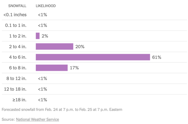
For NYT’s The Upshot, Aatish Bhatia, Josh Katz and Margot Sanger-Katz show the full distribution of expected snowfall in your area instead of just the middle:

The range can be wide. That’s because predicting snow remains tricky, especially several days out, said Alex Lamers, a warning coordination meteorologist at the National Weather Service. Getting a snowfall total right requires predicting the path of a storm correctly, estimating the amount of precipitation and understanding additional factors — like the temperature high in the atmosphere, or wind speeds close to the ground — that can influence the snow’s density.

The Weather Man with Nicolas Cage is such an underrated movie.

Tags: , , ,

False positives with prenatal tests for rare conditions

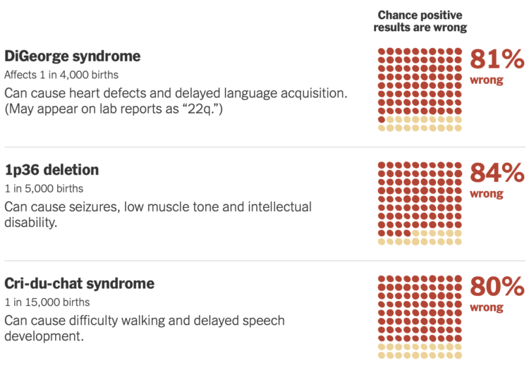
Sarah Kliff and Aatish Bhatia for NYT’s The Upshot look at the uncertainty of prenatal tests for rare conditions. For some tests, the results are more often wrong than they are right, which causes issues when expecting parents don’t know that.

Along with square pie charts, the piece goes into more detail with unit charts to explain what the percentages mean from a counts point of view. So if a reader doesn’t quite know what a false positive is before reading, they will have a better idea after.

Tags: , , ,

Job growth was underestimated

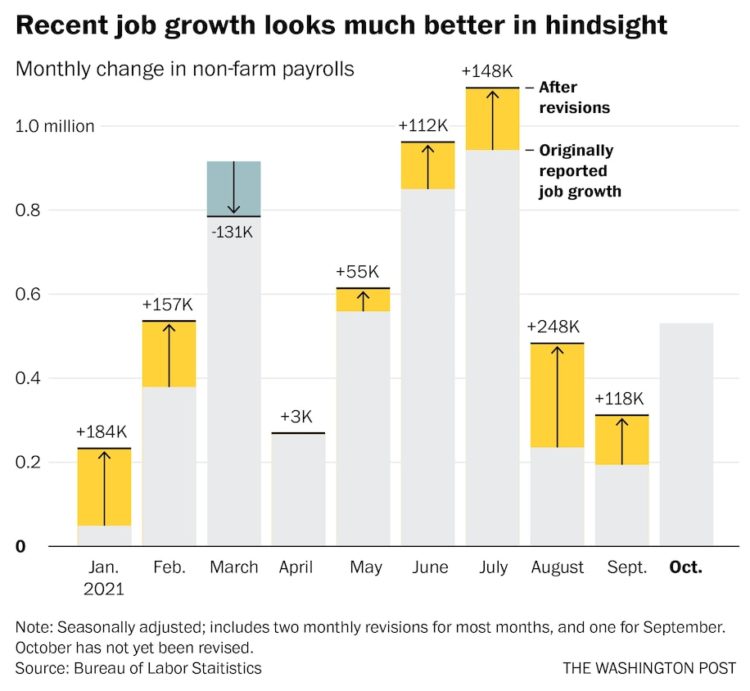
Andrew Van Dam for The Washington Post used a bar chart with corrections to show new monthly estimates from the Bureau of Labor Statistics for job growth:

After the revisions, disappointing months like August looked a lot more like October, a month that was hailed as a labor market rebound. In hindsight, while a blockbuster June and July were even better than they looked, they didn’t lead to months of stagnation — they diminished somewhat, but still produced solid, steady growth that continued through October.

It’s like the data carries uncertainty, which can make estimation a challenge. Imagine that.

Tags: , ,

Writing about probability in a way that people will understand

We see probabilities mentioned in the news, in weather forecasts, during sporting events, political arguments, business reports, elections, medical advice, and scientific findings. But probability is a tricky concept that not all (most?) people understand. Grace Huckins for The Open Notebook outlines useful ways to communicate the numbers more clearly — to increase the chances readers do understand.

On using concrete numbers over percentages:

Concrete numbers can also make statistics feel more personally relevant. A 0.5 percent risk of developing a particular kind of cancer may seem minuscule. But if a reader went to a high school with 1,000 students, they may find it more impactful to hear that five of their classmates, on average, will develop the disease. In a March 2021 story, American Public Media used concrete numbers rather than percentages to communicate race disparities in COVID deaths. They reported that 1 of every 390 Indigenous Americans had died of COVID.

Other tips include using visuals, relatable comparisons, and acknowledging uncertainty instead of speaking in absolutes.

Tags:

How perception can save lives

Visualization and perception researcher Lace Padilla was on the kid-centric show Mission Unstoppale to talk about visualizing uncertainty:

I approve of this message.

Tags: , ,