Amanda Cox promoted to New York Times data editor

Amanda Cox is the new data editor for The New York Times:

As data editor, Amanda will continue to provide direction for The Upshot, and she’ll add the expertise from Computer-Assisted Reporting journalists in New York and software developers here and in the Washington bureau. She’ll serve as the top adviser to the executive editor and managing editor on statistical questions like polling methodologies and election forecasting, and she’ll participate in conversations with desks as they discuss data-oriented reporting that may aid our economics, technology and investigative coverage.

In her time here, Amanda has helped bring together some of our best explanatory and statistical reporting efforts with our smartest visualization experts, and now she’ll do that on a bigger stage.

Great news for both Amanda and NYT.

Tags: ,

Amanda Cox is new editor of The Upshot

The Upshot, the data analysis-centric site from the New York Times, has a new editor, and her name is Amanda Cox.

I have asked Amanda to take on this job because she is the best person to lift The Upshot to new heights. But I also want to note an underlying message in her appointment. Visual journalism – graphics, interactives, photography, video, virtual reality – is a growing part of our report, and it’s an area where we excel. In the future, visual journalists, and those, like Amanda, whose background spans both words and visuals, are a crucial part of the future leadership of The Times.

So great and well-deserved.

If you read FlowingData, you've seen her work, but if not, here's a refresher.

Tags: ,

Working with R at the New York Times

Amanda Cox

Amanda Cox from the New York Times was on the Data Stories podcast. You should listen. She talks about how she uses R, workflow at the New York Times, and some of her favorite projects.

I listened while picking up my son from daycare. I hope some of it seeps into his consciousness through osmosis.

One note. In the beginning Amanda talks a little bit about how she got started. She was a statistics graduate student getting tired of the theory side of things. Her program didn't look at a ton of data in the first year, which led her to the New York Times, a placed aimed at practicality.

However, no surprise, it varies a lot by program. For example, the UCLA and Berkeley statistics departments get you looking at data early on. I haven't taken a course in years and am far removed from academics, but I only imagine it's more true with the whole data science field evolving into a real thing.

Tags: , , ,

3-D chart for economy’s future

Yield curve

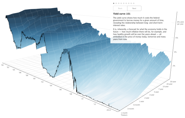
People like to poke fun at 3-D charts, mostly because they don't work or a third dimension just isn't needed. However, this chart by Gregor Aisch and Amanda Cox for the Upshot is a fine exception to the rule.

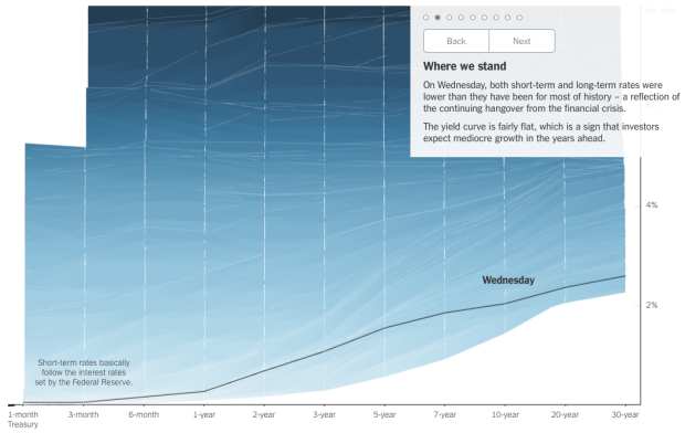
It is a yield curve that shows "how much it costs the federal government to borrow money for a given amount of time" which tends to be a good indicator for where the economy is headed. Time is shown on the horizontal axis, and percentage yield per year is shown in the vertical. The rates for 3-month, to 6-month, up to 30-year loans are shown in the depths of the chart.

With just the initial view alone (shown above), I think the chart confuses many, but the tour of the data at different angles accompanied by explanations make it work. For example, the next step in the narrative transitions to a single timeline to see rates at the time of publication.

Single shot

The smooth transitions at callouts at each step help keep you oriented. Plus, you can rotate the chart yourself by clicking and dragging.

So good.

Tags: , , ,

Increasing rates of men who don’t work

Rise of Men Who Don't Work

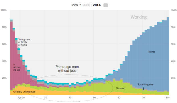
Recent data from the Census Bureau suggests the rate of non-working men has increased. As more women go to work and more men stay at home to take care of the kids, you'd expect for the number of stay-at-home dads to contribute significantly to that rate. But maybe not. There are more noticeable factors to consider like retirement age, disability, and going to school. Amanda Cox for the Upshot has graphs for you.

See also where the men aren't working.

Tags: , ,

Birth year and political leanings

How Birth Year Influences Political Views

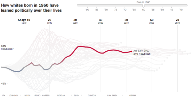
A statistical model, from Yair Ghitza of Catalist and Andrew Gelman of Columbia University, estimates when people form their political preferences. The analysis uses presidential approval ratings from Gallup to approximate political events "that estimates when people form their political preferences."

Amanda Cox for the Upshot demonstrates the model in an interactive. Simply drag the slider to see how the political leanings of you and your birth cohort changed over time. The takeaway: Events between the ages of 18 to 24 are far more influential than those that occur at an older age.

It seems like the model might apply to a lot of things in life.