Birding and data visualization

Jer Thorp has combined birding and data visualization into a unique course called Binoculars to Binomials:

I dreamt up Binoculars to Binomials as a hybrid site of learning. It’s for coders who are interested in cultivating an observational practice, and for birders who want to dive into the rich pool of data that comes out of their hobby.

More broadly, it’s for anyone who’s interested in the overlap between nature, data and creativity.

Sounds good to me.

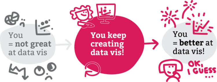
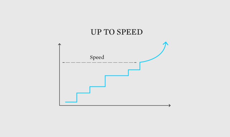
One of the best ways to learn how to visualize data is to apply it to a specific field. You figure out the mechanics and the context behind the data, which makes visualization meaningful and useful. In this case, you get your hands in all parts of the process.

Tags: , ,

Best Data Visualization Projects of 2023

Data continues on its upwards trajectory and with it comes the importance of visualization. Many charts were made in 2023. If I liked something, it was on FlowingData. These are my ten favorites from the year.

Read More

Steps for getting started with data visualization

Getting started with data visualization can be tricky because of all the resources and tools available these days. Approaches also change with what you want to visualize data for. For Datawrapper, Lisa Chartlotte Muth outlines how to take your first steps.

The main theme is to make more charts.

See also: getting started with visualization after getting started with visualization.

Tags: , , ,

✚ Explaining More, Assuming Less

Welcome to The Process, where we look closer at how the charts get made. I’m Nathan Yau, and I’m figuring out what to assume from readers, even if they are smart and well-informed.

Become a member for access to this — plus tutorials, courses, and guides.

Data Visualization State of the Industry, 2022

The 2022 results from the State of the Industry survey, run by the Data Visualization Society, are out. Among 1,218 respondents, see the roles, the salaries, and the responsibilities:

The overall median of the annual compensation graphs is at $60,000 to $79,999 per year, with very few respondents reporting over $159,000 per year, and a small but notable increase in the number of respondents reporting annual compensation in the $240,000 per year or more category.

I’d have to look at the actual data, which you can get for this year and previous, but my hunch that the split distribution in salary is between non-tech and tech workers.

Tags: , ,

Best Data Visualization Projects of 2022

Every year, I pick my favorite data visualization projects, which tend to cover a wide range of purposes but are typically for presentation. Here are my favorites for 2022.

Read More

Information Graphic Visionaries delivered

Visualization still seems like a relatively new thing, but it has a history that goes back a few centuries. The Information Graphic Visionaries book series celebrates this history with a profile of three makers — Florence Nightingale, Emma Willard, and Étienne-Jules Marey — and their work.

The series started as a Kickstarter campaign and the books have been making their way out. I just got my copy on Marey and the graphic method. I’m looking forward to digging in.

Tags: ,

A lot of galaxies

NASA released an image from the Webb First Deep Field telescope, which shows a whole lot of galaxies:

Thousands of galaxies – including the faintest objects ever observed in the infrared – have appeared in Webb’s view for the first time. This slice of the vast universe covers a patch of sky approximately the size of a grain of sand held at arm’s length by someone on the ground.

We are tiny specks.

Tags: , ,

Unregulated location data industry

For The Markup, continuing their reports on data privacy, Alfred Ng and Jon Keegan discuss the non-regulation of the location data industry:

Without government regulation, the current approach from Apple and Google is to play catch-up with data brokers for each new way that location data can be shared, experts said.

For example, while app developers could potentially lie to Apple and Google without any way to audit the companies, they face a bigger risk if they violate laws like the European Union’s General Data Protection Regulation.

The law, which requires companies to disclose all third parties who could receive a person’s data, could be a stronger check on direct server transfers than app store scrutiny.

Tags: , ,

Best Data Visualization Projects of 2021

Phew, just made it. These are my favorite data visualization projects from 2021.

Like last year, there were many Covid-related charts on the internets this year. While they are important to gauge the state of things, I found myself veering away from them to focus on other areas. I craved distraction, practical information for the times, and anything outside the bubble.

Read More