What’s a personal blog for, if not to blow my own horn? Well, it can only be to blow the horns of those who I…
The post Species-related publications appeared first on Evolving Thoughts.
Adam's Blogroll: click through to the author's blog
What’s a personal blog for, if not to blow my own horn? Well, it can only be to blow the horns of those who I…
The post Species-related publications appeared first on Evolving Thoughts.
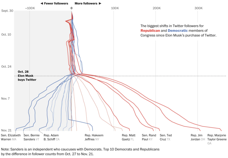
You might have heard that Elon Musk bought Twitter, and among the many recent changes to the platform comes what appears to be an ideology shift. Gerrit De Vynck, Jeremy B. Merrill and Luis Melgar, for The Washington Post, show the shift through the lens of a baseline chart and follower counts among popular Democrats and Republicans.
Tags: Elon Musk, followers, politics, Twitter, Washington Post
Posted by in Elon Musk, followers, Politics, Statistical Visualization, twitter, Washington Post
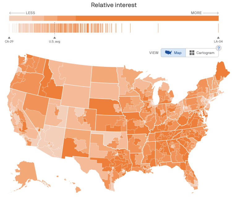
To estimate public interest in the many political issues across the United States, Axios used Google Trends data to map issues by congressional district. Switch between the many topics, and you see a choropleth map (that can change to a cartogram), along with a barcode chart to show the distribution of interest among all districts.
I’m not sure if it’s that beneficial to see the overall geographic distributions for most topics, but it’s useful as a point of reference to look at specific districts. For me, the barcode chart is the most interesting with the distributions shifting quite a bit from topic to topic.
As we know by now, conservatives in the U.S. are more commonly against getting vaccinated for Covid, but it wasn’t always like that. Vox shows how ideas shifted to get to where we are now.
The 1990s elementary school aesthetic with markers and overhead projector slides works well here. The choices guide you step-by-step through the data points.
Tags: coronavirus, politics, vaccination, Vox
Posted by in coronavirus, Politics, Statistical Visualization, Vaccination, Vox
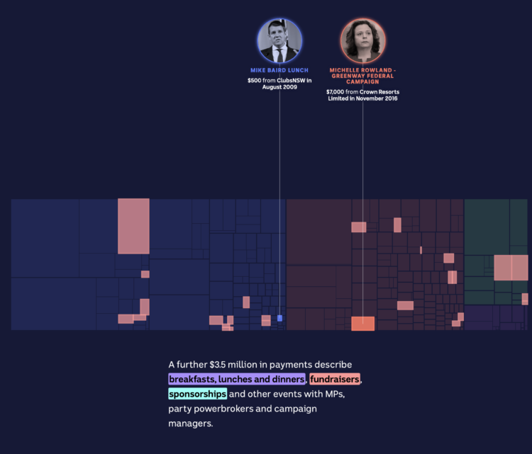
The Digital Story Innovation Team for ABC News in Australia looked at political donations from the gambling industry. The piece goes all-in with treemaps in a scrollytelling format to show categories and individual donations.
It starts with an individual point and keeps zooming out more and more. Then when you think it’s done, it zooms out more.
Tags: ABC News, contributions, politics, scrollytelling
Posted by in ABC News, contributions, Politics, scrollytelling, Statistical Visualization
Posted by in Freedom, Philosophy, Politics, Race and politics, Rant
Center for Responsive Politics and National Institute on Money in Politics are merging their datasets to make it more accessible:
The nation’s two leading money-in-politics data organizations have joined forces to help Americans hold their leaders accountable at the federal and state levels, they said today.
The combined organization, OpenSecrets, merges the Center for Responsive Politics (CRP) and the National Institute on Money in Politics (NIMP), each leading entities for three decades. The merger will provide a new one-stop shop for integrated federal, state and local data on campaign finance, lobbying and more, that is both unprecedented and easy to use.
Good. More important than ever.
Tags: government, money, OpenSecrets, politics
Posted by in Data Sources, government, money, OpenSecrets, Politics
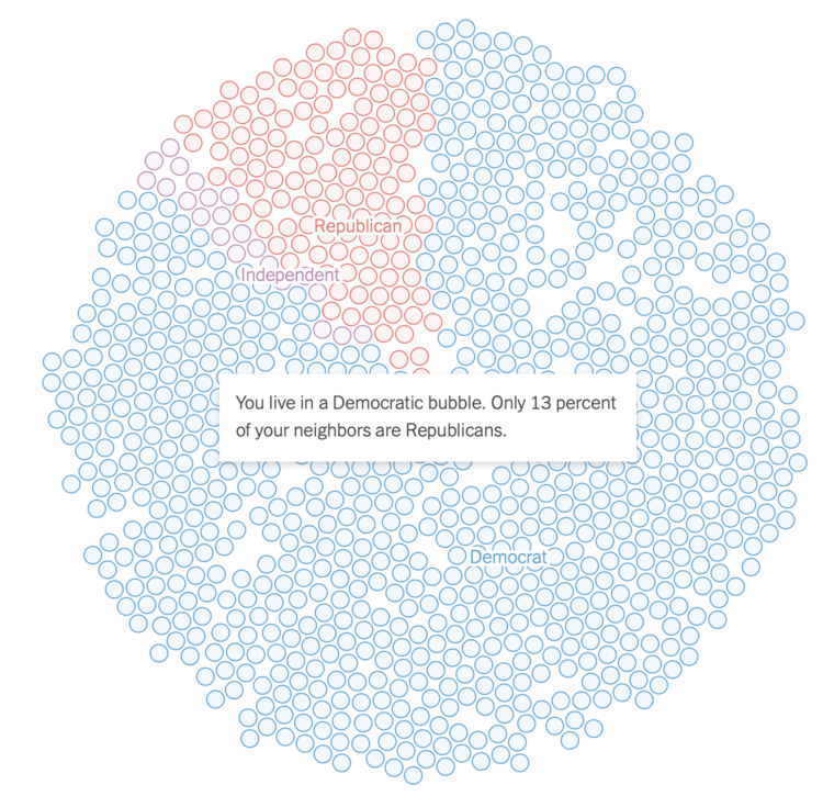
Gus Wezerek, Ryan D. Enos, and Jacob Brown for NYT Opinion use neighborhood-level data to show how those around you voted in the 2020 election. They ask: do you live in a political bubble? Enter an address to see.
This is riffing off of NYT’s similarly-themed map from 2018, which asked the same question but answered more geographically. This newer version, as is the current way of doing things these days, is more bubbly and mobile-focused with the scroll format.
Tags: bubbles, election, New York Times, politics
Posted by in bubbles, election, New York Times, Politics, Statistical Visualization
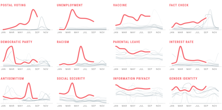
In Waves of Interest, a collaboration between the Google News Initiative and Truth & Beauty, see the defining search trends of 2020. See trends over time. See trends over geography. See trends over past election seasons.
See also how the work came together.
Tags: Google News Initiative, politics, search, Truth & Beauty
Posted by in Google News Initiative, Politics, search, Statistical Visualization, Truth & Beauty
Posted by in Ecology and Biodiversity, Politics