Satellite imagery at a cute angle

Maybe you remember the SimCity-like views through satellite imagery from a few of years ago. Robert Simmon from Planet Labs returns to the topic discussing practical use cases and advantages over a top-down view:

Satellite imagery surrounds us — from Google Maps and daily weather forecasts to the graphics illustrating news stories — but almost all of it is from a map-like, top-down perspective. This view allows satellite data to be analyzed over time and compared with other sources of data. Unfortunately, it’s also a distorted perspective. Lacking many of the cues we use to interpret the world around us, top-down satellite imagery (often called nadir imagery in remote sensing jargon) appears unnaturally flat. It’s a view that is disconnected from our everyday experience.

Tags: ,

Red-blue electoral map and the green-gray in satellite imagery

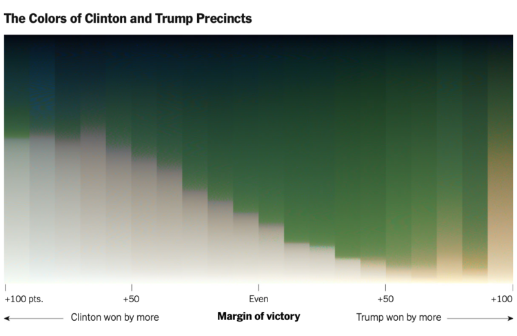
For NYT’s The Upshot, Tim Wallace and Krishna Karra looked at how the red-blue electoral map relates to the green and gray color spectrum in satellite imagery:

The pattern we observe here is consistent with the urban-rural divide we’re accustomed to seeing on traditional maps of election results. What spans the divide — the suburbs represented by transition colors — can be crucial to winning elections. It’s part of why President Trump, seeking to appeal to swing voters, has portrayed the suburbs as under siege and menaced by crime. But the suburbs are neither politically nor geographically monolithic. They are where Democratic and Republican voters meet and overlap, in a variety of ways.

The breakdown and process are impressive. Be sure to check out the full rundown. Wallace also provides more details about how this came together on the Twitter.

Tags: , , , ,

DIY satellite ground station to receive images from NOAA

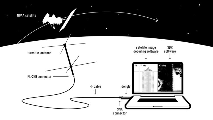
You can basically hook up an antennae to your laptop and start receiving images from space. This DIY guide from Public Lab amazes me.

The NOAA satellites have inbuilt radio antennas that transmit the data collected by the AVHRR instrument on a frequency in the 137 MHz range. To minimise interference between satellites, each NOAA satellite transmits on a different frequency within the 137 MHz range.

[…]

Your antenna is a sensor. It catches electromagnetic waves and transforms them into an electrical current i.e. an electrical signal. All antennas are tuned to specific frequency ranges meaning that they receive or transmit these frequencies best. Most antennas are directional.

I need to try this.

Tags: ,

Urban growth via satellite imagery

For The Upshot, Emily Badger and Quoctrung Bui looked for major urban developments in the United States by comparing satellite imagery of past to present:

To grasp the scale of this decade of change, The Upshot worked with Tim Wallace and Krishna Karra from Descartes Labs, a geospatial analytics company, using a tool that has itself evolved significantly over this time: satellite imagery. With its growing power and precision, we can see both intimate details — a single home, bulldozed; a tennis court, reinvented — and big patterns that recur across the country. Here, we show some of the most consequential changes over the last 10 years, as seen from above.

The resolution is impressive (but still creeps me out a little bit). And while maybe not as fun to watch as a time-lapse, the two-snapshot treatment provides more contrast, which makes it easier to see the change. I also like the two small dots on the right of each image to indicate progress while scrolling.

Tags: , , ,

High-resolution satellite image of Kincade fire, up close from far away

I feel like satellite imagery has upped its skillset in recent years. According to Rob Simmon, the image below from Planet of the Kincade fire in Sonoma, California was taken from 600 miles away in Utah.

Tags: , ,

Photographs from above, an Overview

Overview is an ongoing project that uses a zoomed out view for a new perspective on the world:

Seeing the Earth from a great distance has been proven to stimulate awe, increase desire to collaborate, and foster long-term thinking. We aim to inspire these feelings — commonly referred to as the Overview Effect — through our imagery, products, and collaborations. By embracing the perspective that comes from this vantage point, we believe we can stimulate a new awareness that will lead to a better future for our one and only home.

Far away enough to see patterns. Close enough to stay connected to the parts.

Tags: ,

Imaging Earth on the daily

Over the past four years, Planet deployed 293 satellites in low orbit to take a snapshot of Earth every day. This animation by Nadieh Bremer shows how the snapshot gets pieced together. Most of me is like, yeah awesome. But then there’s that remaining bit of me that is a little bit nervous.

Tags: , , ,

Average view of Earth from space

Using a year’s worth of daily images from NASA’s Visible Infrared Imaging Radiometer Suite (VIIRS), Johannes Kroeger constructed the average snapshot for 2018. Fun.

Tags: , ,

A closer look at the U.S.-Mexico border

The Washington Post provides a flyover view of the barriers at the U.S.-Mexico border. It’s a combination of satellite imagery, path overlays, and information panels as you scroll. It gives an inkling of an idea of the challenges involved when people try to cross the border.

Tags: , ,