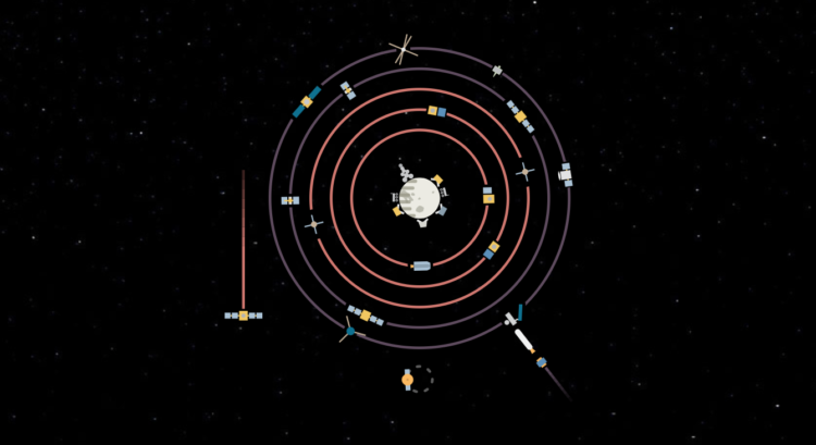
Spacecraft orbits

For The New York Times, Jonathan Corum illustrated the dozens of spacecraft orbiting planets and objects in the Solar System. The piece starts at the sun and then makes it way towards interstellar space. Showing active and inactive spacecraft, it’s part history lesson and part cute animation.

Tags: , , ,

Coronavirus life cycle

For The New York Times, Jonathan Corum and Carl Zimmer describe how the SARS-CoV-2 Coronavirus hijacks your cells, makes copies of itself, spreads through the body, and infects others.

The vertical scrolling provides a clear path from beginning to end of a life cycle, and the color transitions separate various stages. Informative.

Really wishing we could just skip to the end.

Tags: , , , ,

Opportunity rover’s path on Mars

After a most unforgiving dust storm on Mars, NASA ended the 14-year mission with the Opportunity rover. It was originally only planned to last 90 days. Jonathan Corum, for The New York Times, mapped the little guy’s journey over the years.

Tags: , , , ,

Visualization for an audience

Jonathan Corum, the Science graphics editor at The New York Times, talks about his experiences communicating scientific research to the public. Much of visualization design is about figuring out the audience and making graphics for that audience, so Corum uses a lot of examples that start from technical research papers and finish with a more focused result.

Tags: ,