✚ Pushing Out the Charts

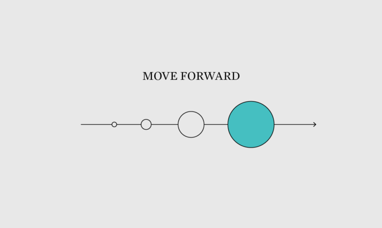
Welcome to The Process, the newsletter for FlowingData members where we look closer at how the charts get made. I’m Nathan Yau. In the land of what-if and what-about, it’s surprisingly easy to get stuck staring at your work, thinking about how your audience will hate it. On the internets, where the audience is (potentially) everyone, the feeling can really mess with your process. You have to let things go.

Become a member for access to this — plus tutorials, courses, and guides.
✚ Chart Practice: Changing the Audience

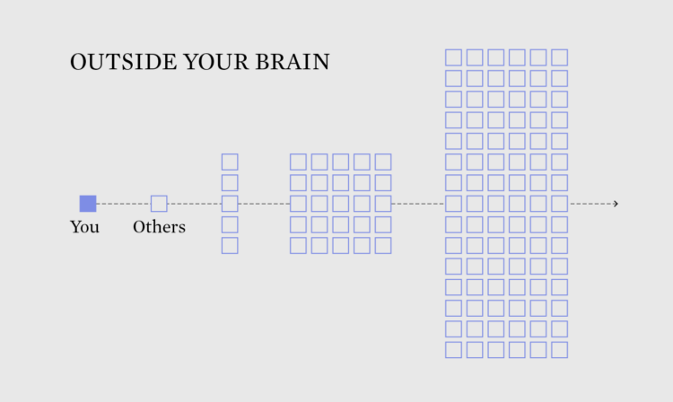
Welcome to The Process, where we look closer at how the charts get made. This is issue #243. I’m Nathan Yau, and after a short distraction with fake charts, we’re back on meaningful visualization practice. This week is about switching up your audience, because the charts you make and how you make them should adapt to who you make the charts for.

Become a member for access to this — plus tutorials, courses, and guides.
✚ Explaining More, Assuming Less

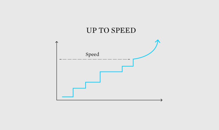
Welcome to The Process, where we look closer at how the charts get made. I’m Nathan Yau, and I’m figuring out what to assume from readers, even if they are smart and well-informed.

Become a member for access to this — plus tutorials, courses, and guides.
✚ Narrow Audience

Welcome to issue #231 of The Process, where we look closer at how the charts get made. I’m Nathan Yau, and this week I’m thinking about communicating data to as few people as possible.

Become a member for access to this — plus tutorials, courses, and guides.

✚ Eggtastic Graph

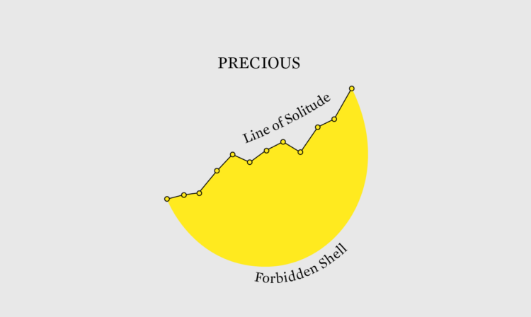
Welcome to issue #224 of The Process, where we look closer at how the charts get made. I’m Nathan Yau, and this week I’m reminded to not treat every data graphic like a precious, delicate flower to be held ever go gently because of its small but ever so important petals.

Become a member for access to this — plus tutorials, courses, and guides.
✚ Visualization for One

Welcome to issue #202 of The Process, the newsletter for FlowingData members that looks closer at how the charts get made. I’m Nathan Yau, and I’m visualizing data for one person and hoping for the best.

Become a member for access to this — plus tutorials, courses, and guides.
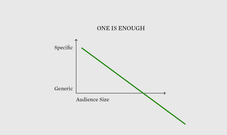
✚ Debating About Visualization – The Process 172

Welcome to issue #172 of The Process, the newsletter for FlowingData members about how the charts get made. I’m Nathan Yau, and this week I was thinking about… spirals? What.

I was going to grace you with my 10,000-word thought piece on the nature of spiral charts and their relationship to life itself, but I’m placing it on the back burner for now. Sorry.

Become a member for access to this — plus tutorials, courses, and guides.
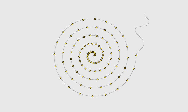
✚ Connecting Data to Practicality – The Process 166

Welcome to issue #166 of The Process, the newsletter for FlowingData members that looks closer at how the charts get made. I’m Nathan Yau, and this week my attention span is hanging on to dear life as we head towards Thanksgiving here in the U.S. I’m also thinking about the often missed next step to making the numbers more than just numbers.

Become a member for access to this — plus tutorials, courses, and guides.
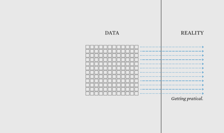
✚ I Want to Visualize Aspects of the Data – The Process 162

Welcome to issue #162 of The Process, the newsletter for FlowingData members that looks closer at how the charts get made. I’m Nathan Yau, and this week I’m less interested in the data and more interested in aspects of it.

Become a member for access to this — plus tutorials, courses, and guides.
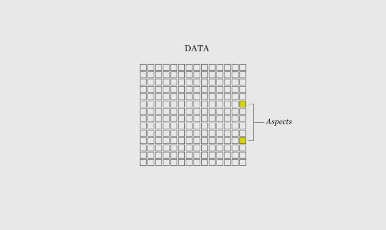
✚ Charting for Others (The Process 086)

There's a new tool-agnostic course now available for members. Check it out now. Read More