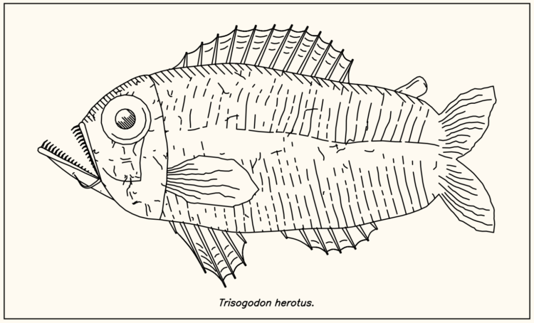
Procedurally generated fish drawings

Lingdong Huang’s project fishdraw seems straightforward on the surface. You go to the page and there’s a drawing of a fish. But then you keep clicking the refresh arrow and realize the fish are procedurally generated, including the name on the bottom. So good.

Tags: , , ,

Drawing the coronavirus

What does the coronavirus look like? Rebekah Frumkin for The Paris Review highlights various illustrations and renderings, focusing on why each looks the way it does:

The disease that has put the entire world on pause is easily communicable, capable of stowing silently away in certain hosts and killing others, and, to the human eye, entirely invisible. In media parlance it’s become our “invisible enemy”: a nightmarish, oneiric force that can’t be seen, heard, or touched. But with the use of modeling software, scientists and illustrators have begun to visualize coronavirus, turning it into something that can be seen, understood, and, hopefully, eventually vanquished by science. Many of us imagine the virus as a sphere radiating red spikes—but why? Certain elements of these visualizations are based on the way coronavirus appears under a microscope, and others are choices that were made, an exercise of artistic license.

Tags: , ,

Machine learning to erase penis drawings

Working from the Quick, Draw! dataset, Moniker dares people to not draw a penis:

In 2018 Google open-sourced the Quickdraw data set. “The world’s largest doodling data set”. The set consists of 345 categories and over 15 million drawings. For obvious reasons the data set was missing a few specific categories that people enjoy drawing. This made us at Moniker think about the moral reality big tech companies are imposing on our global community and that most people willingly accept this. Therefore we decided to publish an appendix to the Google Quickdraw data set.

Draw what you want, and the application compares your sketch against a model, erasing any offenders.

Tags: ,

Looking for cultural expression in 50 million doodles

Using Google’s Quick Draw dataset, a collection of 50 million drawings across 345 categories, Mauro Martino looked for visual differences and similarities across countries in how people doodle. The result is his project Forma Fluens.

As you can see above, drawings of an eye, the sun, and a face came out roughly the same. But then there are country-specific things like a power outlet:

Good stuff. [Thanks, Mauro]

Tags: ,

Mixing cartography and landscape drawing

Artist Matthew Rangel hikes cross-country and through the mountains, exploring and drawing along the way. He then mixes his drawings with maps and photos from history for unique results and perspective.

My location drawings of large expanses throughout my journey serve to reinforce our land-based visual codes by the activity of transcribing the land through yet another system of careful measurements. This practice deepens my personal connection with the land, lending a sense of embodied awareness of its natural and/or unnatural characteristics. I allow the process of discovery from gathering extensive research to play out in the final compositions, where maps I have gathered are combined with my location drawings to set the stage to depict personal encounters and experiences that re-present the land through a framework that speaks of the constructs humans place on the land which, in turn, inform our experience.

[via Socks]

Tags: ,

Draw the patterns of Obama’s presidency

A couple of years back The New York Times asked readers to draw on a blank plot the relationship between income and college attendance. It was a way to get you to think about your own preconceptions and compare them against reality. The Times recently applied the same mechanic to the changes during Barack Obama’s presidency.

Bonus: Here’s how to make your own you-draw-it graph.

Tags: , , ,